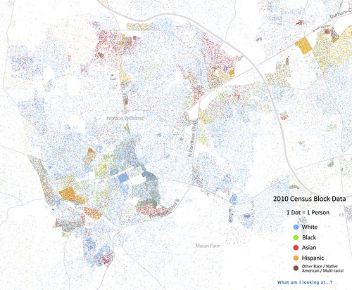
I recently read an article about "The Best Map Ever Made of America's Racial Segregation" which shows a dot for every human in the U.S., color-coded by race.
So I checked it out and zoomed in on the Chapel Hill Metro Area. Here's what I found:
More Information:
Comments
I can very easily see the outline of the apartments where I live shaded in red and the condos next door shaded in blue and then the red picks up again for the apartments beyond that. It makes me wonder what the representation on our city council would look like if we had a district model for electing them.
If you find maps like this interesting, the race dotmap is only the second one created after the overall Census dotmap earlier this year.At the Census Tract level, www.richblockspoorblocks.com does a good job of highlighting differences in incomes and rents by neighborhood.
One problem with this map is that it implies white, black and Hispanic are all exclusive categories, when they are not. As the Census form makes clear, race (white/black/etc) and Hispanic origin are distinct questions. The classification process has been criticized (see here), but even beyond that fundamental question it would be helpful to know what Hispanic means on this map.


The first things I noticed were that: there are more Asian neighborhoods in Chapel Hill than I knew about, and the densest areas (besides campus) tend to be the least white. I really would like to hear what others see in this. Check it out at http://demographics.coopercenter.org/DotMap/