(Cross-posted from my blog at geoffgreen.org)
Meadowmont is a neo-urban neighborhood in Chapel Hill, North Carolina. It was designed with a mix of uses and is trumpeted as a walk-friendly community, with sidewalks along both sides of the street and a network of greenway trails. (It was also designed as a station for a light-rail line, but that's a different story.) During the approval process, Meadowmont's developer emphasized its "pedestrian orientation for working and living." So you would hope that the design of the sidewalks, roads and intersections would consistently reflect the importance of access for people traveling on foot.
Alas, you would be wrong.
This is the UNC Wellness Center.
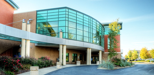
It provides an an assortment of health and wellness services, among them cardiovascular exercise facilities, group classes, an aquatics center, nutrition services, and a cardiac rehab center. It's a place dedicated to improving the health of its patrons, which makes its driveway entrance onto the surrounding roadway so disappointing. It makes vehicular access a priority while ignoring the safety of pedestrians.
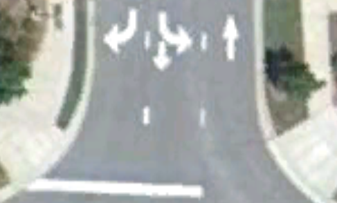
Here's what you see if you're trying to cross the intersection at its driveway:

There are several problems here. First, you can see that the stop bar is in front of the pedestrian path across the intersection. That invites cars to block the path of pedestrians. By directing the cars to proceed up to that point, it puts pedestrians in danger from drivers who are focused on the road that they don't notice the possibility that someone might be stepping off the intersection. From personal experience, this is a real danger because there are plenty of drivers who speed up to the stop, as well as plenty of elderly drivers whose reaction times are not up to par.
Second, the intersection has a very wide turning radius. It's perhaps easier to see on this image:
This also increases the pedestrian danger. It's an invitation for cars to take the turn from the roadway onto the driveway at high speed. It increases the distance that pedestrians are in the roadway as they attempt to go from one side of the intersection to another. That increased distance is especially dangerous for people who can't move as fast, such as the elderly residents of the retirement community across the street. Drivers also find it harder see pedestrians as they are outside the driver's line of sight.
The Federal Highway Administration points out:
Designing intersections with smaller turning radii slows traffic speeds and allows perpendicular curb ramps to be positioned parallel to the crosswalk path of travel, as well as perpendicular to the curb (Section 7.2.1). In addition, smaller turning radii significantly decrease crossing distances for pedestrians, as shown in Table 8-1. Smaller radii also enhance detection of the crosswalk and improve crossing conditions for people with vision impairments because there is a greater distinction between the perpendicular and parallel traffic flows.
Also look at the curb cuts. Because of the wide turn, they are pointed at the middle of the street, not towards the destination sidewalk. For the able-bodied, it may not be a big deal, but a wheelchair is going to follow the slope and will need to be redirected into the proper orientation. It's simply a bad design.
Finally, the driveway is designed for three lanes of traffic. Three lanes! Given that it exits onto a low-volume, three-lane street, it boggles the mind why that much asphalt was deemed necessary.
The folks who designed facility were well aware that the pedestrian access along the sidewalk was inadequate. Just compare how they designed the crossing at the sidewalk with an internal crossing from their parking lot into their facility.
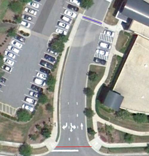
The red line at the bottom of the image shows the sidewalk crossing, while the blue line indicates the crosswalk between the parking lot and the facility. You'll note how the three wide lanes of traffic at the entrance compress to two narrow lanes as driveway continues towards the lot. The crossing distance at the crosswalk is only 27 feet, just slightly more than the width of two lanes of traffic. There's another crosswalk just north of the blue line, not shown in this picture that's only 22 feet wide. The sidewalks continue directly out to the edge of the traffic path, making it easy for drivers to see pedestrians and those on foot to watch for cars.
Down at the intersection, where people not going to the Wellness Center need to cross, the distance is 47 feet, That means it takes the average traveler twice as long to cross as it takes the Wellness Center patron. And of course, drivers who have entered into the Wellness Center's driveway recognize they are in a driveway and that they need to be aware of pedestrian-auto conflicts. On their exit, though, pedestrian concerns are shunted aside and they are encouraged to travel on to their next destination with haste.
What to do? There are two easy steps. The first is to tackle the low-hanging fruit by pulling back the stop bar. Make it clear to drivers that there's something between the driveway and the road that they need to be concerned about, and that they're not entering onto a wide road along some commercial strip in strip-mall land. it's a cheap and easy fix.
The second step is to decrease the turning radius. A complete fix would be expensive, but there are some interim fixes. Restripe the road to remove one of the travel lanes — there's not a lot of traffic leaving the Wellness Center at any one time, so removing one lane of exiting traffic would have minimal impact on departure time. Paint stripes along the shoulder to narrow the travel space allotted to cars and install bollards to expand the space clearly allocated to pedestrians. This Greater Greater Washington post provides an example of some cheap fixes.
The real lesson here though is that as we design our streets and pedestrian paths, we need to think of more than just the interests of autos. If such poor intersection design can occur even in a place that was specifically planned for pedestrian access, we must be all the more vigilant elsewhere.
(UNC Wellness Center photo from the UNC Wellness Center; Aerial imagery from Google Earth.)
More Information:
Issues:


Comments
Really great work Geoff...
Really great work Geoff...
Thanks!
Much appreciated. - geoff